Wednesday, December 9, 2015

Project 3- Photo Restoration Reflection Journal

               In project 3, we had to incorporate some of the skills and tools we learned in lab 6. For this given project we used the application Adobe Photoshop CS6. This project was a bit different from the previous projects we have done because we were given a photo which had many stains on the background and on the two girls faces, arms, and hair. The photo we were given, focused on two little girls and we had to retouch all the stains, located all over the photo. I only used the patch tool, clone stamp tool, and the healing brush tool to complete this project. I used the patch tool when it required me to get rid of the stains from the girls hair. However, the first step I took in completing this project was getting rid of the stains from the background. I did this by using the clone stamp tool, cloning the blue colored background onto the stains. Next, I used the clone stamp tool again to get rid of the stains in the white blanket, located at the bottom. Since part of the fingers from one girl was missing, I used the clone stamp tool again to fill in the missing part of the finger. Afterwards, I moved on to use the healing brush tool. I used the healing brush tool to get rid of the stains in the girls arms and part of the stains located in the face. I barely used it on the face because at times it made the face look bruised. Therefore, for the face I used a mix of both the patch tool and history brush. The girl on the left side had her whole lips stained. Due to this, I had to use the patch tool by using destination and not source, I patched the lips of the girl to the right and then moved the copy onto the lips of the other girl. After this, the lips still did not look as great so I tried fixing it a little bit by using the clone stamp to try to fill in parts of the lips. Furthermore, I used the patch ( using destination) too as well to patch one of the eyes from the girl to the right and locate it to the left eye of the girl loved to the left because her left eye was great stained.
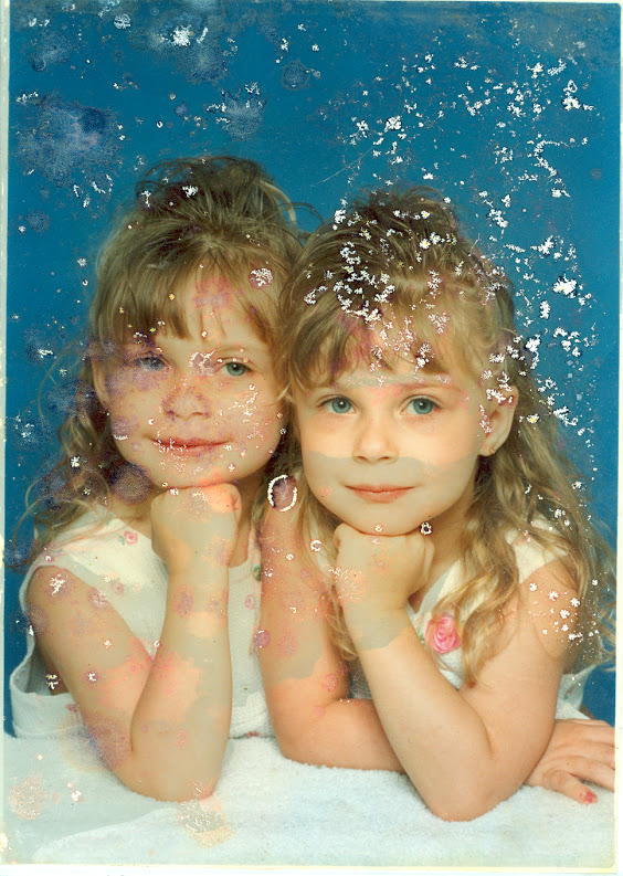
               I was not able to finish this project. However, even though I couldn't finish this project, I did boy doing this project very much. It was a bit difficult to get rid of some stains but I found it fun. I was a bit disappointed that I wasn't able to finish retouching the photo because I believed I was doing a good job. In this project I learned something new, I learned the that you can use the patch tool in two ways, either using source or destination. Source is when you patch something and it disappears and when you use destination, when you patch something it's sort of like duplicating the subject you patched and moving it to the destined place you want. When doing this project I found that the most easiest part was getting rid of the stains in the background because it had a big space in which you cannot mess up. I was scared to do the hair because I thought it was going to be very hard because I did not really know how to use the patch tool. However, this project has helped me further improve my skills and understanding in using the patch tool. I believe this project made us think more because we had to use the right tools in order to make the photos look original. By original I mean not retouching the photo in a way that it seems like we edited, by using the right tools, we do not have to over edit the photo. We have to make the photo look realistic. Most of my classmates wanted to finish the project on time, so they just patch the face of the girl to the right and used destination to put it on the girl to the left. I did not do this. A reason for not doing this was because each girl may look similar, like twins, but they have features that distinguish them from each other. Therefore, I tried using other tools to get rid of the stains, even though patching the face could have made the job quicker. In this project you need to have the patience, work hard, and take your time. Additionally, to improving my understanding on the patch tool, I also managed to get work on my patience. I'm glad with the progress I made. With this project I have learned to be more patient and use my time wisely. This will help me in the future because this project has taught me some of the skills magazine editors have to do on a daily bases, which is not as easy and quick to accomplish. Project 3, has shown me a career I may be interested in the future.

            Original                                                           Retouch                                                                                                


Sunday, November 29, 2015

Lab #6 - Editing Tools Reflection Journal

          We were given four photos to edit. For our first lab this third marking period (our 6th lab overall), we were required to use the application Adobe Photoshop CS6. In this lab we learned how to use new photoshop tools such as, the clone tool, spot healing brush tool, healing brush, patch tool, smudge tool, dodge tool, sharpen tool, blur tool, burn tool, and the sponge tool. The photos we were given, we had to fix some minor errors located in the images and make them better. However, in competing this process, we had to make sure we did not edit the photos too much that they seem edited. In pic a, I used the clone tool to fix the rip in the bottom left of the picture, in order to use the clone stamp you have to press down the option key, so the tool can get a hold of what you want to clone. Next, I used the spot healing brush to get rid of the sprinkler heads. The following picture, picture b, I used the healing brush to erase the initials DJ from the rock and to erase the chips and holes. Then, I used the patch tool to get rid of the big crack located on the right side. For picture c, I used the healing brush to get rid of the wrinkles located in the mans forehead. In addition, I used the patch tool to get rid of the following wrinkles under the eyes. Lastly, in picture d, we first started off using the marquee tool to select the top part and change its color, I changed the color to a maroon color by using replace color. Afterwards, I applied the smudge tool for the tiles in the bottom. I used the sharpen tool to sharpen the right windows and the blur tool to blue the left side of the window. The dodge tool was needed to be applied on the the side of the window door and on the right side I used the ben tool. And for the finishing touch, I used the sponge tool to desaturate the left side of the roses and to saturate the right side of the roses.
          I found this lab a bit easy because some pictures were easier to edit compared to others. The thing that made this project a bit difficult was because we were brought upon new tools we have not used in our previous labs or projects. Most of the tools were easy to learn, but one tool I found myself having difficulty using was the patch tool. I feel like I still need more practice using the patch tool out of all the tools we have learned to use. This is why when recreating picture c, I had trouble because in order to get rid of the wrinkles under the eyes we had to use the patch tool. I was a bit scared because I did not want to over exaggerate a picture, making it seem like I edited it too much. I found this picture the most difficult to work with. However, I really enjoyed editing the last picture, picture d, because it required us to experience/use the most tools. And I really loved how picture d came out as a result, as well as my other three pictures. Overall, I found this project very fun to work on especially when we used the text tool because we also learned how to use the rectangle tool. We used the rectangle tool, and filled the background with a gradient color and then we used the text tool to place our text inside the rectangle. This time we were able to warp our text into a different style. In the future, these new tools will help us emphasize on a picture especially because I the tools we learned in the project can help cover up mistakes and make some mistakes not seem like mistakes.


Tuesday, November 17, 2015

STEM Symposium Reflection

     Our trip to Queens College, the STEM Leadership Symposium event, was a great experience that taught me great things. At the beginning of the presentation, we learned and discussed about leadership. My definition of a great leader, is someone who knows their strengths and weaknesses, using their strengths to teach others and knowing how to improve their weaknesses. In leadership communication is very important because everyone must state their thoughts in order to accomplish a mission in a satisfying way. My favorite part of this trip was when the four individuals spoke to us about STEM/ coding. This was my favorite part of the symposium because they told us not to worry or be scared of what's to come. Everyone has to go through obstacles in order to accomplish and learn new things. There always comes a point in our lives in which we have to try very hard and work nonstop to learn something new, and all that effort comes to us becoming an expert at something. Additionally, we have to be confident and not be scared of taking risks. Taking risks means to try hard no matter what the outcome turns out to be because at the end you know you did something right and you followed your instinct. In additions, to this I liked how they told us no matter what carter we want to pursue STEM still comes in handy because as the 21st, technology plays a huge role in society. In any career, there's always a way you can connect technology to it. However, the part I didn't like in the symposium was that in the panel ( where the 4 individuals spoke) they mostly talked about coding. I wished they could have talked a bit more about other things instead of just sticking to one topic which was coding. Overall, I hope to attend other symposiums such as this one to learn much more things to broaden my knowledge.


Monday, November 16, 2015

Class Performance Reflection

               As of November 16, 2015, my final second marking period grade is a 96.2. In this class, I perform greatly in the homework/blog category. I do best in this category because I always compete my homework and complete it when its due. I can never go a day without making sure if I have homework to complete. For example, when I write my blogs, I write down all the emotions and ideas that come up in my mind. I try to write as most thorough as possible in order to make my writing and thoughts flow smoothly. However, I perform worst in the project category. But on the other hand, I am not missing any assignments. I can further improve in this particular subject by gaining more confidence in my work and work much harder than I do. I must give it my all, to not stress over anything and not give up. Instead, I should tell myself that I can finish my projects and labs on time, in a way in which I will be proud of my work. One major problem is that I must manage my time in a more precious way. As the year progresses, I know I will get better in doing labs and projects because I will have more practice using some photoshop tools, and as I get more comfortable with my classmates, I could improve my class participation as well.


Friday, November 13, 2015

Lab #4- Image Adjustments (Part 2)

         This fourth lab was mostly considered as a test grade for us. We only had 20 minutes to complete it but afterwards we got more time to complete this lab due to the number of individuals who weren't able to finish. In this lab we had to pick the choice of either choosing one of our pictures or choosing the car picture given to us. First, I opened a new file, named it Lab4_my name_vd and made sure the canvas size was 800 by 600. I placed the image of the car and then made two canvas, I dragged the car image into the second canvas and once I did this, I duplicated the image 3 times, in total I had four images of the same car. Before we had to go to image and change its size to 250 by 186. Once I did this, I moved the duplicated images and overlapped one after another. The whole point of this lab was to adjustment the images. Therefore, for the fourth layer I went to image and  adjustments and then for this layer we had to use the Black and White technique. At then end I called the later Black and White. Next, for the third layer I renamed the layer Saturation because in this image, we only had to increase the color saturation, nothing else. Afterwards, in the second layer, we had to remake the red color of the car. I did this by going to Replace Color ( located under the image menu) and then at first I wasn't sure if how to replace the color of the color, but then I saw if you increase the fuzziness of the picture, it was easier to see the car. I picked a color (green) and clocked in the car, at the end the red car turned green, and I renamed the layer Replace Color. Finally, for the first later, I only changed the hue of the image, either by increasing or decreasing the hue.
          In order to fully complete this lab, I used the text tool to type which image adjustment I used for each image. I placed the text next to each image. Since, we had another day to complete this lab, I tried to make it better by just adding the original image, in order to show the difference between the original picture and the adjustments I used got each image. I saved this file as a PNG and uploaded it to JupiterGrades. I'm very proud of my result, at first I was having difficulties because due to the amount of time we were told we had to complete this project, I felt a bit a scared of not being able to finish the prohext. This made me not think clearly about what I first had to do, but then I told myself to calm down and have faith that I'll finding the project, this made me think much more better. Some of the skills needed to complete this lab reminded me of the skills we had to use in the Warhol project.  Overall, I think this lab was great because it tested how much we remember, such as the skills we learned in previous labs and projects. 


Lab#5 Filters Reflection Journal

             For Lab #5, we used the application Abode Photoshop CS6, in this lab we had to experiment with the filters. We had to select two different types of pictures, one to use for the liquify filter, which was mandatory to use, and another picture that we must duplicate another 4 times in order to apply a different type of filter. In order to apply the liquify filter, we had to use a photo of a person (for example a photo of ourselves) and for the other photos, we could have chosen any picture we wanted.  For the first picture, I used the liquify effect, then for the second picture I used the glowing edges effect. As for the third picture, I used Ocean Ripple which can be found in the distort section of the filter gallery and in the fourth picture I used Lens Blur, which is found under filter and blurs. Afterwards, for the fifth photo I used Photocopy which is found under Sketches and for the final picture I used the Paint Dabs effect which is located under the Artistic section of the filter gallery. For the finals touches, I added texts, labeling which effect I used for each picture and we were even required to add a filter to the background. We did this by going to filter and then going to render and clicking on clouds.
                 This lab has taught me a new skill and has also taught me that there's more to photoshop than what we think. With photoshop, there are many options to use to enhance or make a photo look more interesting. In this lab, I enjoyed doing this and experimenting with the filters because there were so many filters I wanted to use. However, I chose the filters I believed looked great with the picture. What I mean is, for example, I chose the ocean ripple over other effects under the distort section because unlike the other effects, Ocean Ripple made the photo seem more interesting and makes the viewer see the result of the effect very crystal clear. For this lab, I did not take much time to finish it because we have already had practice duplicating layers, and writing texts in photoshop. I had no difficulties completing this lab, all I can say is that I enjoyed this lab very much. Lab #5, well help me later in the future because when we want to edit photos, we have to make sure the photo editing is appealing to the viewers eye and well make the viewer not take their eyes off it. The filters must make a photo look more intense and interesting than the original picture. 


Monday, November 9, 2015

HW- Note Taking

           Our whole lives, we have been required to take notes. Note taking is very important because notes help us review a certain topic and when we need to refresh our minds, we could just look back at the notes taken. At school, when taking notes, we have to use the Cornell note taking format. On the left side of my notes, I write important key words I know I should remember and are going to be appear often throughout the curriculum. On the right side, I write the definition of words. However, if I know I am having a hard time remembering or understanding a term, I put a star next to that term.  I find the Cornell Note taking format to be a great method of organizing notes because it helps us organize notes in a simple and neat manner. At times although I take notes in class, I do not understand or reminder anything discussed in class. Therefore, I rewrite my notes to help me remember the terms learned in class. When taking notes it's very immoral to write down the definition of a term, in words you comprehend. If you write down the definition of a term with a language (or use of words) you do not understand, then its useless taking notes. Everyone has a different method of taking notes and using those notes to understand a certain topic.


Wednesday, November 4, 2015

Andy Warhol Portrait Reflection Journal

Andy Warhol was an American artist, born in Pittsburgh, Pennsylvania on August 6, 1928,  known as a leading figure in pop art. In this visual art movement known as pop art, Warhol explored the relationship between artistic expression, celebrity culture, and advertisements. Drawing soon became Warhol’s favorite childhood pastime. Besides, devoting his time to commercial art, he began devoting more attention to painting. Eventually, about 11 years later, in 1961, he brought upon the concept of what is known as “pop art”. In 1962, Warhol and pop art was brought into spotlight nationwide, as a result of his well known exhibited iconic paintings of Campbell’s soup cans.

Warhol has created portraits of many individuals. In Warhol’s portraits, he using uses bright colors for the features on and surrounding the persons face. He usually, makes the features brighter than the background and face. Warhol’s portraits remind me of a tessellation pattern because a tessellation is a pattern of the same subject used over and over again. I would buy Andy Warhol’s artwork because unlike other artworks, Warhol uses a variety of bright colors to contrast certain subjects and make them stand out. In popular culture, critics play a huge role. Some individuals criticize without having enough facts to prove their point. This is called an uniformed opinion. However, when someone has a variety of resources to make a claim it’s called an informed opinion. A person’s opinion can usually harm a persons self esteem or make a person stronger, and make them work harder to prove others wrong. When someone is bias, they usually do not like something, but taste is different because that means you do like something.


In class, for our second project, we had to create a Warhol portrait of ourselves. To complete this Warhol portrait, we used the application Adobe Photoshop CS6. First, I had to take a picture of myself from my head to my shoulders. I created a file and placed my portrait. To complete this first huge step, I had to go to file-Artistic- and then cutout. Next, I created a new file and created a folder, then, I created a folder. I copied the folder three more times and dragged the photos from the new folders onto the canvas. Finally, I chose a color for my background and used the paint bucket tool, to color my portrait. Artists have painted portraits throughout ages because portraits are important.  Not only can you capture the beauty of nature, but you can also capture the beauty of someone’s face. In a portrait, you show expression and the portrait can be more strongly expressed if you use color. After creating a Warhol portrait, I feel like I gained some skills I can use in the future. In the future I can use these skills because I now know to compare and contrast colors in order to make a certain piece look nice, and make a certain subject stand out. 

Sunday, October 25, 2015

Lab #3 - Image Adjustments

          For lab #3, we used the application Adobe Photoshop CS6 in order to do image adjustments. In order to accomplish this lab we first went to Jupiter grades and saved a picture of our teachers dog. Next, we had to open Adobe Photoshop and go to File and then Place, and we placed the picture of the dog. Then, we had to use the skills we developed from our first project (The Melon Head) by using the tool we feel most experiments with. We had to use this tool to select the dog and then do image adjustments. In this case, I used the quick selection tool in order to select the dog and then do layer via copy at lesst 5 times, I copied the dog at least five times. And I resized the dogs to a smaller size and did this by pressing down on the shift key and dragging the picture, I did this so the picture could not change from its original form. I found this lab difficult because we had to select the dog and try to select every little piece of hair and select it will with no blue spaces. Our teacher taught us to use refine touch. Refund touch helps give an image a finishing touch. For instance, in this case we used refine touch to get rid if of the blue spaces. However, I failed to do so because when I used the refine touch to get rid of the blue spaces, the hairs of the dog (towards the top) looked pixelated. Due to the amount of time we had, I had to move on towards the next step.
        After selecting the dog, we had to do adjustments to the dog in order to fully complete the lab. We went to image and then adjustments, then we picked on which adjustments we wanted to make. I used Chanel Mixture, Vibrance, Exposure, Curves, Levels, Black and White, Hue/Saturation, Color Balance, and Brightness/Contrast. Once we finished doing the page adjustments, we had to take a screenshot of our layers by clicking on command+ Shift + 4 and using our mouse to drag the corner of the photoshop window up until where we want to take a screenshot. I enjoyed doing this lab, but I am not satisfied with my results. For example when I took a screenshot of my layers, one of my dogs (the black and white one) came out pixelated. I feel like I should have done better but I suppose the more I practice with the photoshop tools, the better I will become at making selections. This lab helped me learn more about the quick selection tool and it also taught me who to use the refine touch. I still have to practice using refine touch, nevertheless, I know i relax and concentrate much more I will learn how to do marvelous things. However, I still have to keep track of my time and not take a long time to complete labs. This lab will be beneficial to me in the future because right now we are practicing how to use tools such as quick select and later on we well have less time to complete our labs. Therefore, the more practice we get using the tools, the quicker we can complete labs or projects in the future.


Monday, October 19, 2015

Lab #2 - ( High Point, Low Point, Eye Level, Landscape, and Close Up)

       In our second lab, we previously learned about high point, low point, eye level, close up and landscape photos and how each word is defined. Therefore, after learning these terms we had to pick 5 pictures that would individually show a close up, one eye level, and one picture taken at a high point, and one taken at a low point, and one picture showing a landscape. We were able to obtain these photos due to lab #1, where we had to take pictures. Additionally, we used the application Adobe Photoshop CS6 in order to accomplish this lab. The steps acquired was to first go to file and click on a new file, making sure the width was 11 and the length 8. Next, we went to file and then clicked place, we then picked a picture and resized by holding the shift key down and dragging the corner of the picture. This allows the pictures quality be the same, without changing any resolution. Finally, after we placed all five pictures we used the type tool to show what each picture represents (either high point ,close up, etc...) I found this lab pretty easy to accomplish because we already had practice with the first lab. However, I had some difficulties finding a picture that could represent a high point and a low point because most of my pictures seemed like eye level picture or close up pictures. This would further help us improve skills because the more practice we get doing this process, the easier and quicker it becomes for us to accomplish a certain task.


Friday, October 9, 2015

HW- Creativity (Podcast)

                 After listening to the Ted Radio Hour Podcast, I know this podcast relates to web design because in web design you must have the desire to take risks. Meaning that an individual should just follow their curiosity and not fear of the possible criticism others might give them. Everybody is able to access curiosity and creativity if you put your heart into it. If you are left alone for a while, you can be capable of creating new ideas and let your fear get the ability to get out of your way.  Fear is one of the main reasons people are scared to use their creativity, but being fearless should not be believed because if you love what you are doing and suppress your whole brain from fear, you would only think about what YOU think is the best and well make you pat the back of your shoulder once you have completed your work.  For instance, if you are designing the layout of a webpage, you must use your creativity and be confident about the colors and subjects you use because YOU are the pro, you are the one who is creating a new great idea. This does not only apply to web design but to other careers such as sing writing. When you write a song you express the emotions you feel and no matter what other people think about the songs lyrics, you know its a great song because it the lyrics hold a specific meaning to it. This is the same for web design. At certain times individuals are afraid of not being able to over pass their previous works. For example, if your creation becomes a one hit wonder, but then you make another creation but it isn't that successful, the individual will lose confidence and will be afraid of using their creativity again. It is fine if you do not always top a creation one after another. Just as the Ted Radio Hour Podcast said, " Fear and creativity are like twins, fear can kill creativity."


HW- Lasso Tools

              After accomplishing my first project the melon head lab, I was able to experience using the different types of lasso tools. I used the magnetic and polygonal lasso tool. I believe the easier one to use is the polygonal lasso tool because unlike the magnetic lasso tool, I feel like the magnetic lasso tool does not always select a subject good enough. The magnetic lasso tool selects things based on the pixels in the subject but I prefer the polygonal lasso tool because you can control the lasso, However, its only best to use the polygonal lasso when you want to select/cut a polygon shaped subject. It is important to make selections carefully, without white spaces and rough edges because if you leave white spaces/edges, it takes the attention away from the subject. For instance, if someone looks at the subject they will only be focusing on the white spaces because it just standout from any other vibrating color, the colors contrast.  When making a selection you have to think carefully about what tool is the best to use on a certain subject in order to make a great selection, without any white spaces or edges.


Project #1 - Melon Head Lab

                  For our first project, the melon head lab, we used the application Adobe Photoshop CS6. In this lab we went to went to jupitergrades and opened up the file LB2 Base JPG. I saved this photo and then went to photoshop and clicked on file and then place. I placed the LB2 Base JPG. After this I had to cut each piece of the photo, the Melon, blueberry, macaroni, carrot, kiwi, pear, mushroom, radish, and orang/ orange peel, by using the lasso tool, rectangular marquee tool, elliptical marque tool, magic wand, quick selection, polygon lasso, and magnetic lasso. Since we had a short amount of time to accomplish this lab, I used the tools I believed would help me make a great selection and help me finish on time. I used the elliptical marquee tool to cut the melon, blueberry, kiwi, and carrot because these subjects have circular edges. Therefore, to make it easier for me, I used the elliptical lasso tool and if I wanted to make the circle more circular I held my finger down on the shift key while dragging the mouse. Then I used the magnetic lasso on the radish and orange peel, the magic wand on the orange and pear, and the quick selection tool on the mushroom. We had to cut these subjects from the original file and make sure we select them carefully without leaving any white spaces/ edges.
                 This project was a bit difficult for me, due to the amount of time we had. Especially because it was the first time we were experiencing using some of the tools in photoshop. Also, it turned out a bit difficult for me because by mistake I deleted my project and since I did not save my work beforehand, I had to start all over. However, even though I faced this problem, it did not stop me,  the following day I got busy and worked very hard and fast to finish the project in a decent way. Additionally, I found this project very fun to do because it was the first time I was using the wand. I had the most fun when I was rotating the fruits/ vegetables, trying to use my creativity. I do not believe I used my whole creativity due to me rushing, but I am proud of the work I did, I could have done better. As a result, after doing this lab, I learned how i should use my time wisely and learned how we have to save our work, taking a notice in the actions I make. I know this well help me make my preceding projects better in the future.


Tuesday, October 6, 2015

Color Scheme

             Color is important because imagine living in a word without color? Over centuries, people have believed colors are a way to express how you feel or give a person an idea of how your personality is. My color scheme wheel consists of the colors yellow, light pink, a light-baby blue, green and a pink-red color. I chose this particular color scheme because I believed each of these colors define a part of my personality. The color yellow represents how I am very energetic and have a smile on my face when I greet people. I always try to be happy because by smiling, it can create a more friendly atmosphere. The light colored pink represents how I can be as sweet as a candy. I chose this particular color and not a more darker pink because I feel like a more lighter soft pink denies me because to me a light pink represents someone who's really nice and friendly. The green color on my color scheme represents how I love nature. Ever since I was a small girl, I have always gone to the park with my friends to have fun and distract myself from any problems I am facing. I love feeling the wind and just looking at nature; nature is a part of my life. In addition, to these three colors, the color blue also represents me. I chose a light- baby blue color and not a dark bus color because I consider myself a calm serene individual. I do not like getting into arguments or fights no matter how awful the situation is. Also, I love helping people with any problems they are facing. Finally, the last color on my custom cored scheme is a pink-red color. This color represents part of my personality because I have a passion for the things I do, and I am confident on the work I accomplish. This color matches my personality because I love my family me members such as my mom, dad and sister very much and I would do anything to see them happy and proud. There can be other possible colors which can represent a part of my personality, but I feel that these five colors mainly represent my personality.


Monday, October 5, 2015

Rectangular Marquee vs. Elliptical Marquee


               The rectangular and elliptical marquee tool are both tools which can be found in Adobe Photoshop CS6. These two photoshop selection tools are designed for making selections based on simple geometric shapes and are often the most useful ones. The rectangular marquee tool is designed for making selections based on simple geometric shapes. Some common options that can be see to modify its rectangular shape is by defining its selections opposing corners of a drag motion, allowing a certain a sect ratio to be maintained, and allowing a specific hight/or width to be defined. On the other hand, the elliptical marquee tool is designed to allow individuals to draw oval or circular selections. If you know how to use the rectangular marquee tool, then you'll be able to handle the elliptical marquee tool just as well. To select a round area, you hold on to the shift key while clicking and dragging. I believe the rectangular marquee tool is the most favorable and easiest one to use than the elliptical marquee tool because they have sharp, non rounded corners, making it easier to select. Although, the elliptical tool is also good, people may have a more harder time using it based on its circular edges. Individuals may make more mistakes using the elliptical tool and it seems to me that this tool is barely used. Overall, both of these tools have its advantages and disadvantages, it all depends in the situation you are in.


What is Web Design?


           Web Design is the process of creating websites which can have simple or complex HTMLs. Web designing includes aspects such as webpage layout, content production, and graphic design. Webpages are made up of HTML's, which have tags that define the contents and metadata of each page. Some web designers can either hand code pages (typing HTML or CSS) to they can use a WYSIWYG editor like Adobe Dreamweaver. Applications alike Adobe Dreamweaver can provide a visual interface for designing the web paging layout because the software automatically generates the corresponding HTML and CSS code. Also, you can use management systems like WordPress or Joomla, which provide different website templates that can be used a s a starting point for a new website. Graphic Design plays a big role in web designing, except images must be created separately. An individuals creativity also plays a big role in creating webpages because the individual has to think about the layout and the quality of its page. They have to create a good quality webpage which have to fascinate and satisfy customers.


Rule of Thirds

Rule of Thirds: 

           Photography is all about being creative and exploring the different angles in which you can take a picture. The angle in which you take a picture is very important because it can make a photograph look more prominent. A method that can be used to take photos is by using the rule of thirds. You use this method by making sure the horizon line of the camera is at the top or lower third of the frame. Meaning if you want to take a picture, favorably choose something to focus on and make sure it is either to the top, bottom, right or left. Avoid placing subjects in the middle of the frame. There are other methods of taking pictures, but this method is a great method because you get to make a certain object or subject stand out.


7 Word Definitions

                                                           DEFINITIONS 
  • Raw- a collection of unprocessed data. For instance, instead of processing the image captured by the camera, the data is left unprocessed and uncompressed until it is opened with a computer ( computer program).  It is the most popular format due to its small foe size and internet compatibility. 
  • JPG or JPEG (Joint Photographic Experts Group)- are a common file format for digital photos and other digital graphics. They are the most common file type for images taken with digital camera. Once JPG files are saved, the image quality os lost, as the file decreases. 
  • PSD (Photoshop Document)- a layered image file used in Adobe Photoshop. Also, the default format that photoshop uses for saving data. It allows users to work with the image, even though the file has been saved. When an image is complete, users could flatten the layers and convert the flat image into a JPG,GIF,TIFF, etc.
  • GIF (Graphics Interchange Format)- a commonly image file format, used for images on the web and sprites in software programs. GIF's do not lose the quality of its image, unlike JPG's. Each image can include a maximum of 256 colors. GIF's supports color and various resolutions. It is more effective for scanned images such as illustrations rather than colored pictures. can be used for animations. 
  • TIFF (Tagged Image File Format)- are a common file format for images, especially those used on graphic design. TIFF files can be saved without compression , or they can be compressed to a lower file size. They work on operating systems such as windows and mac. In addition, these files are commonly used in print design and desktop publishing because they can store large, high quality images sun as photos. 
  • PNG (Portable Network Graphics)- is commonly used on the web and is a popular choice for application graphics. It is used to replaceGIF's, but take up more disk space than GIF's. PNG files do not have any blurring and may include over 16 million colors. This format allows web developers and icon designers to fade an image to a transparent background rather than colored background. 
  • BMP (Bitmap)- a commonly used raster graphic format for saving image files. It was first introduced on windows. The BMP format stores color data for each pixel in the image without any compression. With this method of strong image information, allows for high quality graphics and large file sizes. BMP images are often used for printable images, JPEG and GIF's can be bitmaps. 

Friday, October 2, 2015

Lab #1- Reflection Journal

                 As for my first lab, I used the software, Adobe Photoshop CS6. For this lab, I was a bit nervous but excited because it was the first lab I had to do and I did not want to do it wrong. Yet, I was edited because I really liked the photos I took and I wanted to see how they came out. Prior to this lab, we had to take pictures in which we had to focus on one certain object. This objective was a major part in lab number 1. In this lab, we had to pick four of our favorite pictures, from which we took, and add them to a new file of Adobe Photoshop CS6. I did this by first opening the application Adobe Photoshop CS6, next I went on the menu and clicked File and the clicked on new. Once a small window appeared, I named the file and changed the width to 504 and height to 360 and changed the unit to pixels. Once I did this, I changed the resolution to 250 and then went to file again. However this time i clicked on place and picked four of my favorite photos.
                  Once I picked a photo in order to not change the proportions of the photo, I had to hold on to the shift key and drag the corner of the photo into the desired size. When it was time to print out the lab, I was not too satisfied with my results because in the pictures you can see some pixels. I think I did not focus to clearly on a certain object. The objective of this lab was to give us an idea of how we can use Adobe Photoshop and what this application can be used. It gave us an idea of how we can further improve the photos in the future. This lab gave us some practice. This is related to web design because in web design we have to know how to make something have a good quality and have a great resolution, in order to attract the viewers attention. In the future, I know this lab well help later on in future labs because now we have a more clearer and broad idea on how to use Adobe Photoshop in one way and how we can further improve our work.


Wednesday, September 30, 2015

Reflection Journal


              On Friday's walk around school to take pictures, was a new experience for me. It was the first time I walked around an area taking pictures. This experience was amazing because I was able to capture the beauty of nature and other subjects I thought were good enough to capture. Not only was it the first time I held a camera in my hands while walking around the streets, but it was also the first time I was able to take a walk around my school. We went to nice places I never knew existed or were located near my school. The neighborhood where we took pictures seemed like a nice neighborhood, all so calm and peaceful, with my classmates and I taking pictures. Too bad it all ended very quickly. Additionally, this assignment gave me the opportunity to go around other areas to take pictures and experience taking pictures of various things. While walking around the streets taking pictures, I was also thinking about how i could photoshop the pictures. I also was thinking about empathic and balance while taking the pictures.


Thursday, September 17, 2015

Window vs. Mac

                   Year after year, individuals have been debating if windows or mac is better. So which is better? With the latest versions of windows and mac, each program have their own unique qualities. For instance, Mac OSX 10.10 (Yosemite), has the biggest design change in years. It has a design with a flatter appearance and blurred transparency effects, and with its new handoff, users are able to move seamlessly between devices. This means that with the new feature handoff, if users are working on an activity on a specific device then they are able to continue the activity they were doing with any other apple device. Also, individuals still get to enjoy the iBooks app, which is the only one of its kind. Only Macs have iBooks. On the other hand, windows keeps improving greatly. Windows aggressively pursue flatness by abandoning all gradients. Not only that, but windows 10 supports the ability to stream games from an individuals xbox one. The most fascinating feature of windows 10 is the feature cortana. Cortana is like a personal assistant that will help users to find things on their P.C. For example, managing a users calendar, track packages, find files, chat with users and it can even tell users jokes. In addition, the cortana integration, allows individuals to have the ability to write on webpages with inking support and a reading mode too. Overall, both of these programs are great to use, it just depends how you use it because winnows may be more in handy for a specific task than the mac, and vice versa.

Tuesday, September 15, 2015

Who Are You? Why Are you Here?

           
Who Are You? Why Are you Here?

Paragraph 1:  Every individual have their own personalities and beliefs. An individuals personality is something that makes up a person as a whole because not everyone has the same personality . Everyone is unique. So who am I? I am Veronica Gonzalez, a sophomore who goes to Information Technology High School. I got accepted into the web design program, which is one of the classes I am very excited about. Now why am I here? I believe my grades and teacher recommendations, proved that I am capable of working hard, and trying very hard until I achieve what I am suppose to do. Everyone differs from one another.

 Paragraph 2:  As we grow up, everyone has their own dream career. I know that someday I would like to be a fashion designer, but I may change my mind. I know that in web design, I’ll learn how to manage my time more and never leave assignments till last minute. For sure, I will try hard and never give up because I know I am expected to at least try. Trying shows the teachers that you have the determination to work hard even though you are not sure of what you are doing. Someday if I make the decision of being a fashion designer, I know web design would help me because both careers require to know how to compare and contrast colors, in order to attract a viewer. However, I am glad to be in the web design program because I know I am going to learn many new amazing things. I’ll be the first one in my family to learn about web designing.


Paragraph 3: In other classes I am hardworking and quiet because I am too shy. But once I get to know pope and get along with them, I can become quite loud. In some of my classes, I know people so I talk to them often. However I know my limits, if a teacher or classmate is talking I don’t talk. I know for my web design class I am going to still be that hardworking girl and still be that shy girl, until I start getting to know people. It may be hard for me, but someday I just might lose that shyness. And I think this class is going to help me develop he social skills I need in order to get a job. As we begin to interact with one another, for sure we’ll become a family.  This is just the beginning.